Shutter Photo — Concept Work
An international shopping app for photographers and filmmakers.
UX DESIGN
UI DESIGN
PROTOTYPE
MOBILE
CONCEPT

Sign-up
Log in or Start Browsing
Shutter
Discover
Creator's Bag

Peter McKinnon
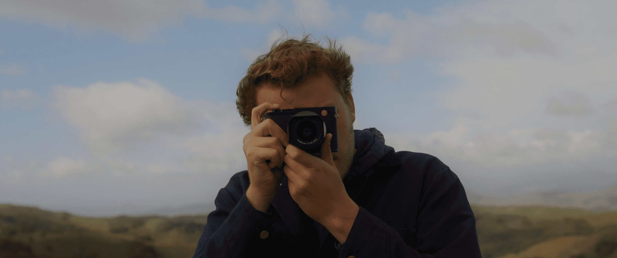
Samuel Elkins
New Arrivals
Overview
The Shutter App was a personal project that I completed during my time at University. As part of the project, our professor assigned us the task of designing an app from start to finish using the double double process. I aimed to create an app that combined my passion for photography and user experience design. Including this University project in my portfolio allows me to demonstrate my design process and critical thinking skills in a more casual manner.
The Problem
One of the biggest questions that gets asked in the photography world is, “What camera or lens did you take that picture with?” This question very rarely gets answered by your favorite photographer on social media and its super hard to choose which brand, body, focal length and accessories to choose from without having some expert advice.
My Hypothesis
I wanted to create an app that would have allowed photographers and filmmakers, regardless of their skill level, to easily see the gear used by their favorite creators in the field and purchase that gear directly within the app. Shutter would have been a social media app where users could have filled in information about their photography gear and process. This way, users could have accessed all the information they needed to make a purchasing decision in a streamlined manner.
User Personas
I began by identifying my target users. I created three personas that I believed would yield the best results during user testing.
Jonni: A full-time filmmaker in his late 20s. He enjoys sharing details about his unique camera setup with clients and others. Using the Shutter app, he can express his creativity, connect with other creatives, and find good deals.
Ernst: An architect in his 50s. Apart from work, he prioritizes his family and cherishes spending time with his children and spouse. He wants a straightforward camera purchasing process that won't overwhelm him.
Aubrey: A university student who excels at solving complex problems through visual storytelling. She wants her gear to reflect her artistic vision. Aubrey aims to find the best-priced gear that allows her to push her creative boundaries without feeling restricted.
Preliminary Wireframes
After creating the personas, I began creating simple wireframes in Figma to generate ideas and establish an architectural structure for the app.
Usability Testing Results
After completing my low-fi designs, I conducted two rounds of moderated usability tests in Maze with 8 different users. It became clear that the app's main purpose was not meeting expectations. The majority of users did not see value in the social aspect of the app. Instead, their primary interest was using the app as a platform for reviewing and purchasing gear, with the option of seeking expert advice when necessary. They mentioned that well-known creatives often already had a video or list on their profile where users could find their gear list.
The Solution
Upon revisiting the drawing board, I still believed that including gear lists for popular creators would be valuable within the app. As a result, I decided to create a category on the discovery page dedicated to well-known creators with diverse backgrounds, where users could find their gear lists.
I conducted a third round of usability testing for the discovery page, involving 4 different users. The users found it useful to know the type of gear that each creative professional was using in their respective fields. As a result, knowing the gear used by their favorite creators became a feature of the app, rather than its sole purpose.
Challenges
Eliminate barriers to entry.
To improve the user experience and eliminate barriers, I have provided users with the option to enter and explore the app without any registration or login requirements. This approach simplifies access and navigation for all users, regardless of whether they are new or returning, and enables them to effortlessly explore the app's features and content.
"KISS" (Keep It Simple Stupid)
When creating the user interface, I focused on simplicity to make the products stand out. By using a minimalistic approach, I created a clean design that improved the user experience. I followed the principle of "KISS" (Keep It Simple Stupid), which means I avoided unnecessary complexity and focused on intuitive designs. This made navigation easy and clear for users. I found a balance between simplicity and functionality to create a user-friendly and visually attractive UI.
Provide a smooth and straightforward purchasing experience.
To ensure customer satisfaction, it was crucial for me to provide a seamless and linear purchasing experience throughout the e-commerce app. This meant that from start to finish, customers should be able to navigate the app effortlessly and complete their purchases without any hiccups. I prioritized the purchasing experience as the MVP of the e-commerce app, aiming to enhance customer engagement and drive higher conversion rates.
Takeaways
As a photographer myself, Shutter is an app that I have noticed is missing from the marketplace. I wanted to communicate the importance of expressing oneself through different creative outlets and being able to find the right tools for the job. Through this process, I learned the importance of listening to the user and being able to pivot large features to fit the user's needs.
Lecia Cameras
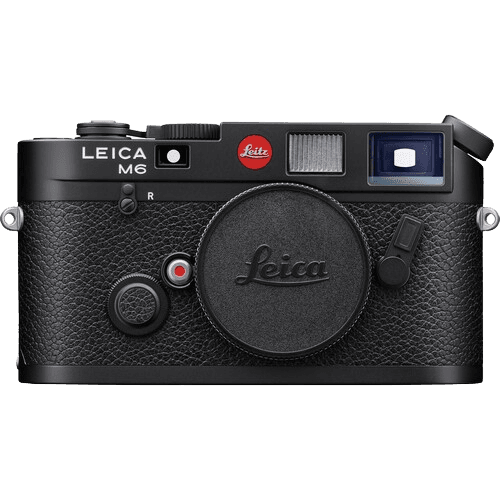
Lecia Q3
Lecia MP
$5,999
Add to cart
Favorites

Lecia MP
Full Frame Sensor
$5999
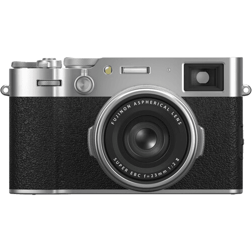
Fujifilm X100
Crop Sensor
$2499
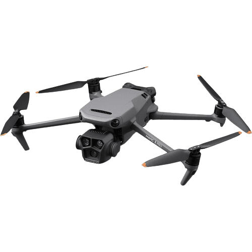
DJI Mavic Pro
Crop Sensor
$1699
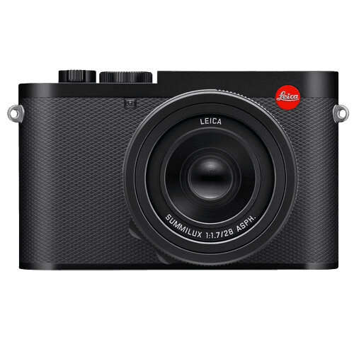
Lecia Q3
Full Frame Sensor
$5999

Lecia MP
Full Frame Sensor
$5999

Fujifilm X100
Crop Sensor
$2499
Checkout

Lecia Cameras
Lecia MP
Full Frame
Qty 1
$5,999
Have a promo code?
Subtotal
$5,999
Shipping
Standard — Free
Estimated Total
$5,999 + Tax
Checkout
Profile

First Name
Trevor
First Name
Wynn
Order History
Payment Information
Shipping Addresses
Designed by Trevor Osswald with a bit of ☕️
trevorosswald@gmail.com
© 2025 | Trevor Osswald
Designed by Trevor Osswald with a bit of ☕️
trevorosswald@gmail.com
© 2025 | Trevor Osswald
Disabled
Sorry, I have disable the mobile view from my portfolio projects.
Disabled
Sorry, I have disable the mobile view from my portfolio projects.